Minimal Black & White Medicine pack
“The medicine packaging plays a role in the treatment”
In France, the National Assembly is currently debating a draft law on Healthcare – to facilitate healthcare in day-to-day life – and these few words grabbed our attention.
After checking our personal medicine cabinets, we felt that if the packaging design had a part in the treatment, some improvements could be made.
Observation
A “bric-à-brac”: boxes in all sizes and shapes that we organise as best as we can, each packaging has its own design/layout of information, all the rainbow colors are represented. But the fact is that when we are ill we are not disposed to play Where’s Wally? or Jenga.
Topic
How to make health care easier in daily life.
We focused our reflexion on “essential medicines” for a basic health care. Medicines that are known for their innocuousness and their efficiency.
Description
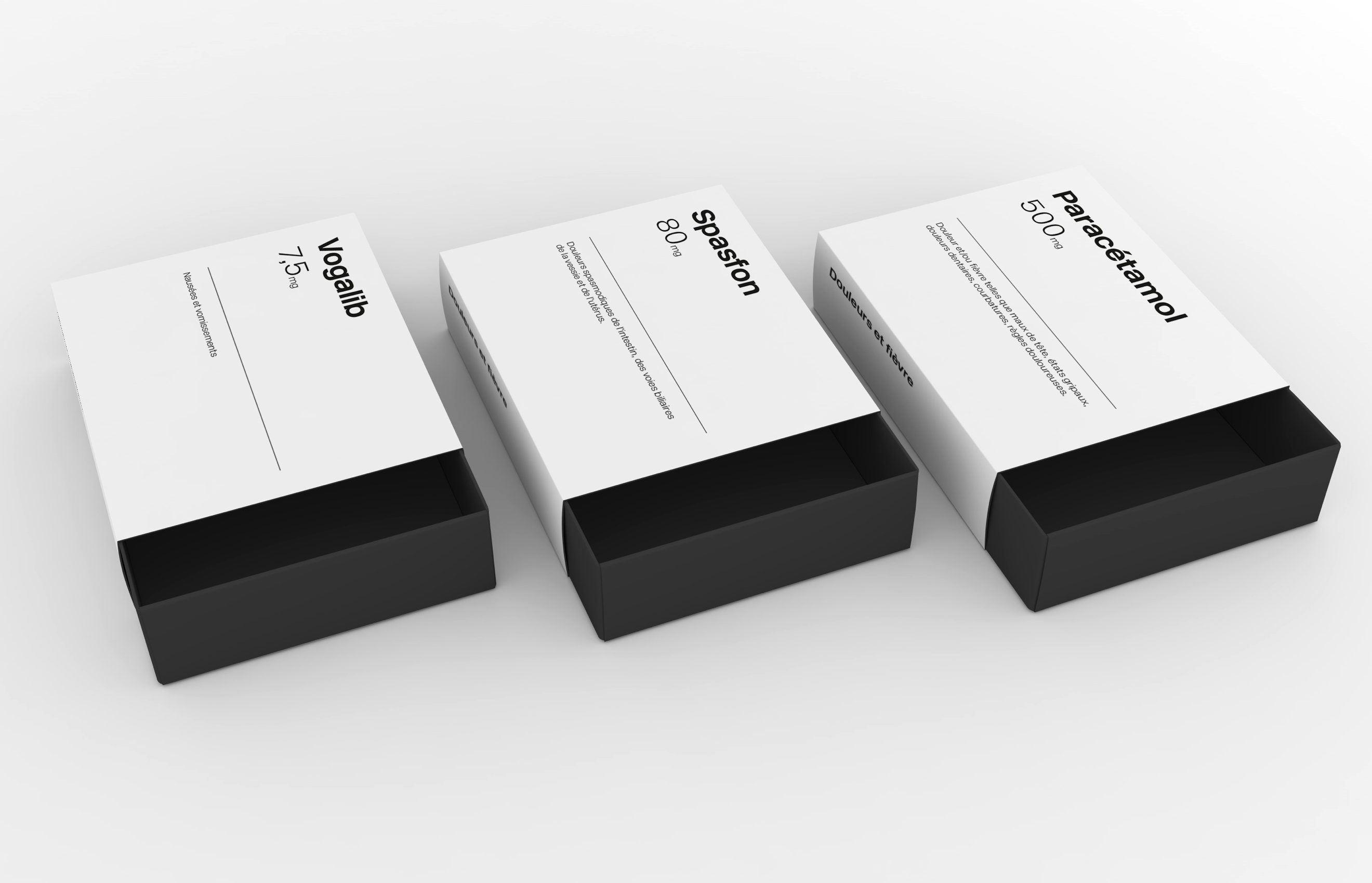
– A sliding box: easy to use
– One size: easy storage and space-saving
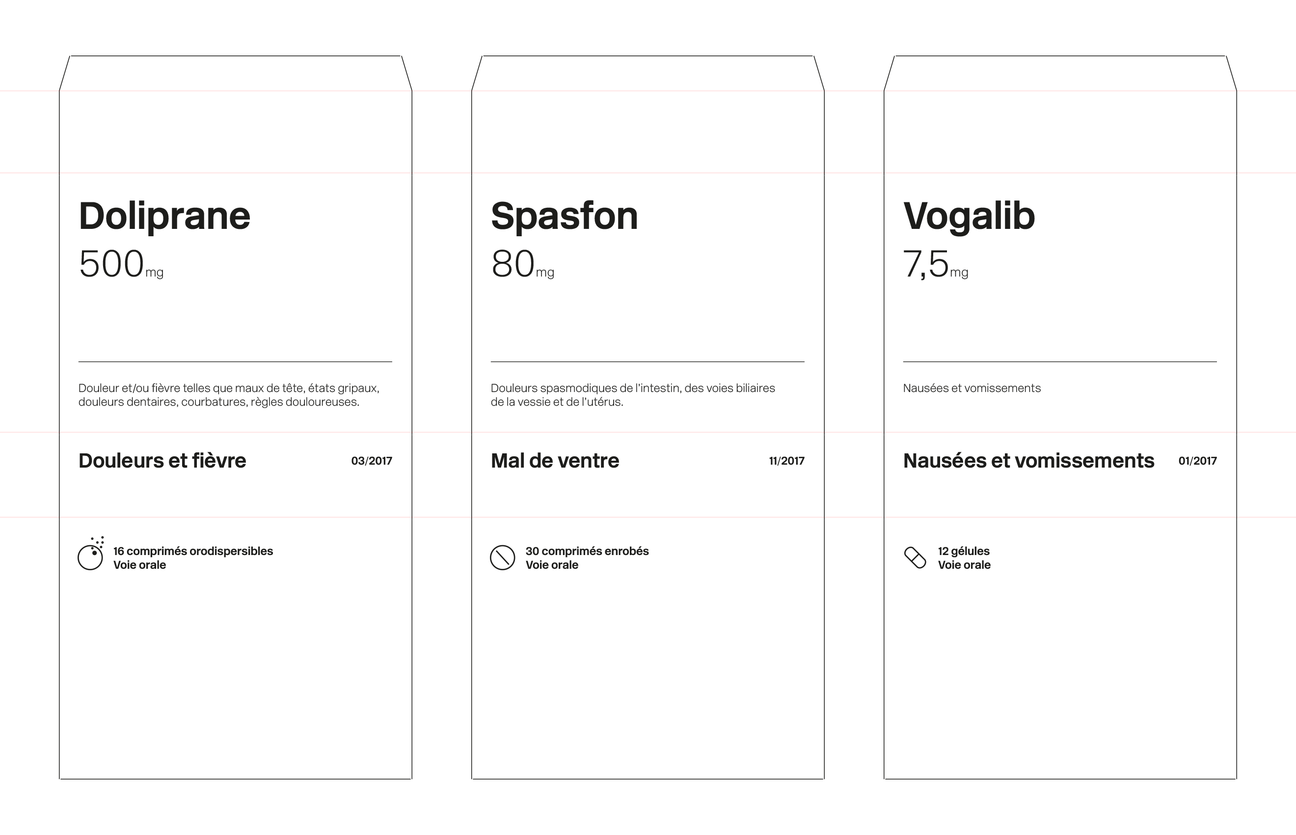
– One layout: easy reading and time-saving
– One colour: neutral colours to avoid the “candy confusion” (dangerous for children) and to reinstate the idea that medicines are not a simple mass market commodity.
One linear reading path that provide just the necessary informations needed to identify and choose the adequate remedy.
On the top: name of the medicine + detailed symptoms.
On the edge: symptoms + expiry date.
Use
Boxes can be piled or aligned. In this way, the symptoms and the expiry date can be seen at first glance. According to this, you can choose effortlessly the appropriate remedy.
Slide the box to open, take a pill, slide the box to close. That’s all.
Conclusion
The aim is to avoid perplexity and unnecessary manipulation at a time we are least able to do anything.


“I consider it an important task and the responsibility of the designer to help bring order into the chaos in which we live.”
— Dieter Rams